Introducing a conversation that revolves around the improvements of Linen Tales visual identity. As you might have noticed, we have recently updated our logo and refreshed some visual elements to give our branding a more uniform and appealing look. Our brand ambassador and an author of 10 books Vaiva Rykštaitė, sits down with graphic designer Dovydas Stonkus to talk about the idea behind Linen Tales visual identity changes and rebranding in general
Dovydas Stonkus is an experienced graphic designer, who claims to be a happy family man, a father of two and a nature lover. Currently Dovydas is working on a new design-related product. His breakfast choices revolve around fried eggs, sandwiches or oatmeal. I invited him to talk about aspects and innovations of (re)branding, which emerged on the looks of the Linen Tales.
What is rebranding? Where does the need for rebranding come from? Is it something to consider on a regular basis, or an exception?
In a very general sense, rebranding is changing the image of a brand. There are lots of reasons to do it: changes in the purposes and structure of the business, merging several brands, tuning in to the new market demands, wanting to stand out among the competition, or simply to refresh the brand in response to the customer needs and preferences.
Rebranding is usually used to solve some business issues. I’d say cases where it involves just a few cosmetic changes is not rebranding, but simply improving and refreshing the brand. And, no, it’s not supposed to take place on a regular basis. The key is to notice if working with the brand is convenient, also how consumers perceive it, and use this information to see if it requires any small or big changes at all. Rebranding can often do more damage than good – continuity of brand image is very important. People's preference for brands with a long history is a good example of it.
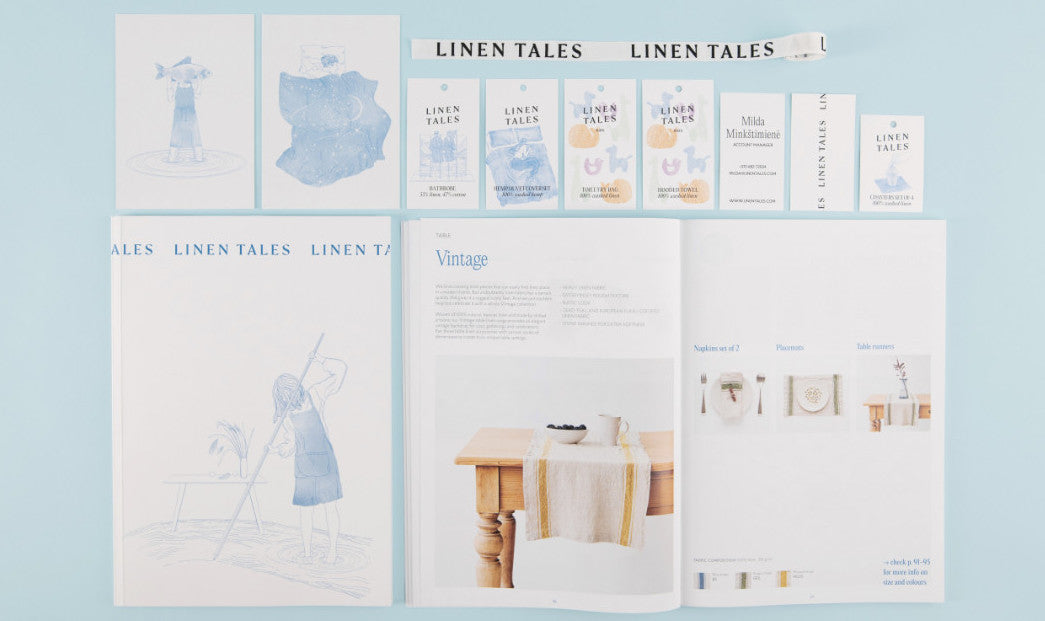
This year, you’ve contributed to changes in the image of the Linen Tales. Are these changes visual, or was it a change of the values and message of the brand?
The visual identity of the Linen Tales became much more consistent. It encompasses all sub-brands while enabling each of them to stand out and communicate the values of their product category at the same time. The values or the message did not change. Basically, the former Linen Tales brand worked well and was positively received by both clients and partners, but the increasing range of activities had to be united under the old visual identity.
Since Linen Tales products cover a broad range of consumers, there was a need for a system to divide it based on the audience they target (or product groups). Home refers to home textile products, Closet – covers clothes, Kids – textile products and clothes for kids. These titles go with the main Linen Tales logo. The visual identity of each version of the logo, used by individual sub-brands, includes graphic elements, directly associated with the sub-brand titles. Home continues to use surrealistic illustrations, Closet – images referring to human silhouettes, Kids – a playful stylised animal pattern. The title of the Shop and Café, as one can guess - a linen shop and a café, both in one. This concept is used in one of the Linen Tales boutiques in Vilnius.
What makes the new Linen Tales logo special? I noticed that the diagonal letters are reminiscent of handwriting. Is it an attempt to communicate something close and cosy?
The new logo has kept all characteristics of the previous one, but the font shapes became more modern and stronger. We also left behind all excess details to obtain a sense of cleanliness. The idea of a diagonal writing and diagonal letter arrangement also came from the old logo. The font itself has some character of its own (font serifs), helping the brand to communicate its maturity, age and legacy. The entire visual identity aims at something close, natural and true to the consumer. The logo is one of the many elements helping to build these associations in the entire system of the visual identity.

I remember the shop assistant at the Linen Tales shop in Vilnius enthusiastically speaking of the shades of hemp fibre bedding referring to the Lithuanian seaside – amber, sand, etc. Perhaps the main colours of black, blue and white, used in the graphic design of the logo carry a message too?
The goal of white, grey and black is staying neutral. It was important to create an identity, which does not compete with the product itself. Since the products feature many colours, I wanted the visual elements on the packaging or other presentation material to be as neutral as possible. The aim of the blue, on the contrary, is to counterweight the neutrality and help the brand stand out among its competitors and be unique. By the way, the sub-brands have their own accent colours as well. These are used sparingly, in balance to all colours used in the entire design.
The vision of a brand. How does this actually work? Is it a smart approach to the client, or following fashion trends, or something else?
They just work :) . Creating a brand is a broad topic. Jeff Bezos once said that ‘your brand is what other people say about you when you're not in the room’. My competence and what I did with the Linen Tales is just a fraction of all that builds the reputation of a brand. The practical purpose of a visual identity is to help consumers in brand recognition, making it easier to convey the message. But it also helps to create a first impression. All visual solutions indicate value, quality and exceptional characteristics of the product, which are crucial in modern business communication. And all this happens in the very first few seconds as the consumer picks up or notices a Linen Tales product.
Okay, then what is more important: the product quality or its brand?
The product, no doubt. The image is a promise of the product, and if the product does not stand up to that image, the consumer is left disappointed. Consumers have a broad range to choose from in nearly any category of products, and sharing feedback on the internet is very easy, so hiding low-quality products under a nice packaging is a very short-term solution.
Do you sleep in linen bedding?
I do, nearly all of my bed sets are made of linen. And, of course, they came from the Linen Tales. The main value in bedding for me, as a designer, is the looks. White walls, lots of light and linen bedding is all you need in your bedroom!
Complete this sentence:
Make your daily life enjoyable and share it with your loved ones.